10 Mistakes to Avoid When Designing Responsive Emails
Creating responsive emails requires careful planning and execution. With more people checking emails on their mobile devices, it's vital to design your emails to look great on all screens. Here are ten mistakes to avoid when designing responsive emails.
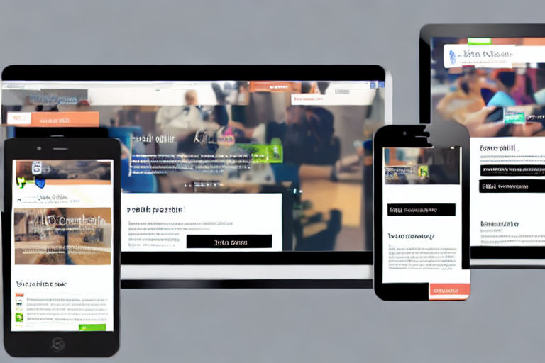
1. Not Testing Emails Across Devices
One of the biggest mistakes when designing responsive emails is not testing them across various devices. Email clients and devices vary greatly, and you need to ensure that your email looks great on all of them. Use email testing tools to preview your emails across devices and aim for a consistent user experience.
2. Sending Emails Without Mobile Optimization
Almost half of all emails are opened on mobile devices. So, if your emails are not optimized for mobile devices, you are missing out on a significant audience. Mobile optimization will ensure that your emails look great on mobile devices and provide an excellent user experience.
3. Not Using Responsive Design
Responsive design is a must-have for creating responsive emails. You should design your emails, so they adjust to the size of the screen on which they are viewed. Use responsive email templates or create your own designs with responsiveness in mind.
4. Ignoring File Size
Email clients will limit the size of attachments, so ensure that your email's file size adheres to the allowable size set by email clients. Large file sizes can slow down email loading times or even prevent emails from being delivered entirely. Optimize images and minimize email copy.
5. Hiding Important Information in Images
Images can increase engagement and make your emails look more attractive. However, avoid hiding crucial information in images because they might not load correctly. Instead, keep crucial information in the email's text copy.
6. Not Using Legible Fonts
When designing responsive emails, take into account that the email's readers will use a variety of devices. Choose legible fonts that are easy to read on small screens, and test them across different devices to check readability.
7. Not Including a Clear Call-to-Action Button
A clear call-to-action (CTA) button directs users to a conversion point on your website. Ensure that your CTA is visible and prominent on mobile devices. Test your CTA button on small screens and ensure it's easy to tap with a finger.
8. Overcomplicating the Design
Simplicity is key when designing responsive emails. Overcomplicated designs can clutter the email and be difficult to navigate, particularly on small screens. Use simple design elements, clear copy, and white space.
9. Neglecting Pre-Header Text
Pre-header text, sometimes called a "snippet," provides a preview of the email's content. Ensure that the pre-header text is optimized to encourage recipients to open and read the email.
10. Not Optimizing for Dark Mode
More email clients are now offering dark mode options. If your emails are not optimized for dark mode, the dark background can negatively impact the email's readability. Test your email's readability in both light and dark modes.
Creating responsive emails doesn't have to be a daunting task. Avoid the ten mistakes above, and your responsive emails will look great on all devices and encourage engagement.


