Responsive Design 101: Creating a Navigation System for All Devices
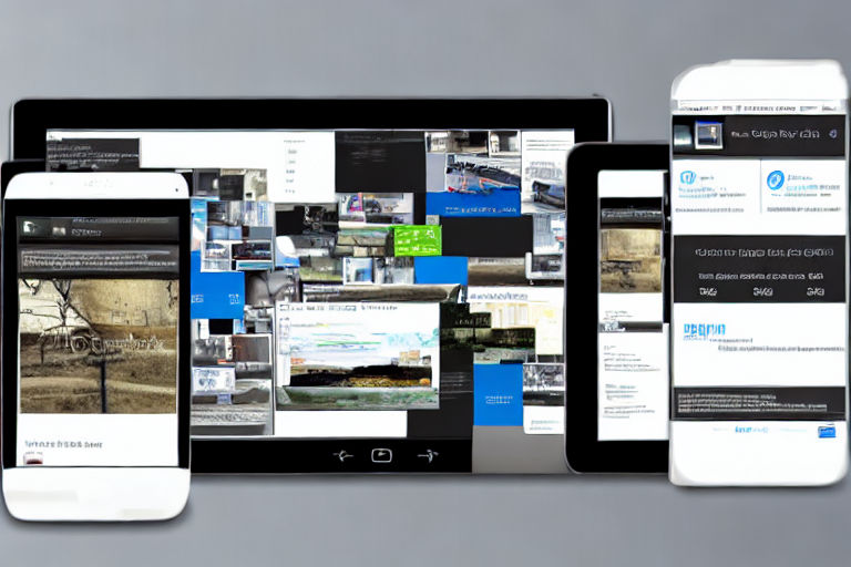
As more and more people access the internet through their mobile devices, responsive design has become increasingly important. Responsive design ensures that your website looks great on all devices, regardless of screen size. In this article, we will be exploring how to create a navigation system that works well on all devices.
Understanding the Importance of Responsive Navigation
When it comes to responsive design, navigation is one of the most critical aspects. Navigation not only helps users find what they are looking for on your website, but it is also essential for search engines to understand your website's structure. A well-designed navigation system helps make your website user-friendly and crawlable, giving it a better chance of ranking higher in search engine results pages (SERPs).
Creating a Responsive Navigation System
There are several things you need to consider when creating a responsive navigation system:
1. Keep Navigation Simple
The simpler the navigation, the better. Avoid overwhelming users with too many options or complex drop-down menus. Stick to the basics: a logo, a search bar, and a primary navigation menu.
2. Use Hamburger Menus
Hamburger menus are three lines stacked on top of one another that act as a button. They are becoming more and more popular in responsive design because they help keep navigation hidden and keep the focus on the content. Hamburger menus are especially useful when space is limited on smaller screens.
3. Make Navigation Thumb-Friendly
Ensure that the navigation buttons and links are large enough for users to click on. A touch screen is not as precise as a mouse cursor, and users might have difficulty tapping small buttons accurately. The ideal size for navigation buttons is 44-pixels by 44-pixels, making it easy for users to click even with their thumbs.
4. Use Responsive Images
Responsive images help ensure that your website's images adjust to different screen sizes. Images that are too large or too small can negatively impact load times and user experience. Use responsive image design to make sure the users who visit your site from large screens receive high-quality images while mobile users have faster loading times.
5. Test Your Navigation System
After creating your navigation system, test it on several devices to ensure that it works as intended. Ask your friends, family, or colleagues to try it out and give you feedback. This allows you to see the design from different perspectives and get valuable insight that can help you improve it.
Conclusion
Creating a responsive navigation system can be a daunting task, but it is crucial to ensure that your website is user-friendly and search engine optimized. Keeping the navigation simple, using a hamburger menu, making it thumb-friendly, using responsive images, and testing are essential factors that help create a successful navigation system. Remember that the more user-friendly your website is, the more likely your visitors are to return, and the higher your website will rank in SERPs.


