psychology of color
web design
user experience
color palette
brand personality
target audience
purpose
color psychology
best practices
contrasting colors
The Psychology of Color in Web Design: How to Use it for Maximum Effect
2023-05-01 11:32:22
//5 min read

Posts you may like
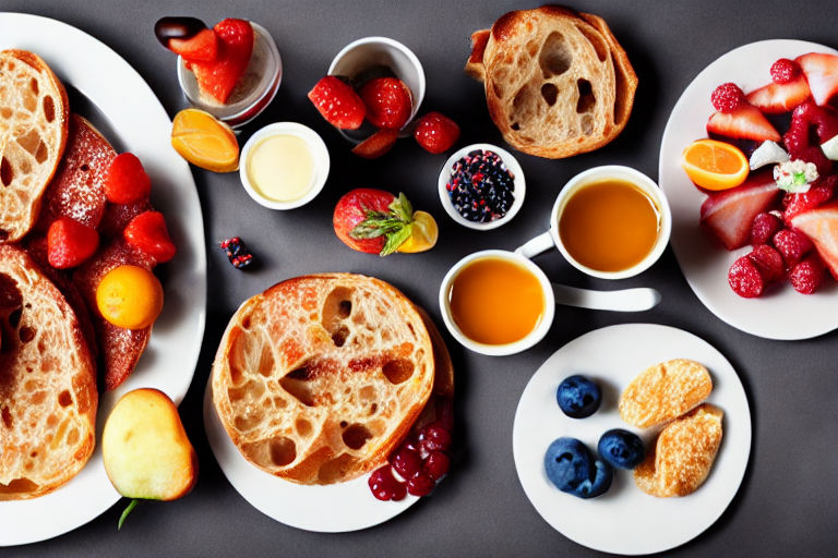
10 Classic Sweet and Savory Brunch Pairings You Need to Try
10 Classic Sweet and Savory Brunch Pairings You Need to Try. Brunch is the perfect meal for those lazy weekend mornings when you have nowhere to be...
Read more

The Future of Work: Embracing Automation and AI
The Future of Work: Embracing Automation and AI The world of work is rapidly changing, and automation and artificial intelligence (AI) are at th...
Read more
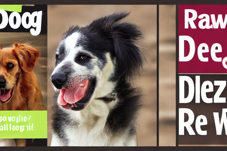
The Benefits of Feeding Your Canine Companion a Raw Food Diet
The Benefits of Feeding Your Canine Companion a Raw Food Diet More and more people are starting to discover the benefits of feeding their dogs a ra...
Read more