Building Interactive Image Galleries with Responsive Layouts using jQuery
Are you looking for a way to showcase your images in an interactive and visually appealing manner? Look no further, as we introduce you to building interactive image galleries with responsive layouts using jQuery. This guide will show you how to enhance your website's design and functionality by creating an image gallery that effectively showcases your images.
Understanding jQuery
jQuery is a powerful JavaScript library that provides a range of features that enable you to add interactive functionality to your website's design. It offers a wide range of pre-built plugins and toolkits that can be used for a variety of purposes, including designing image galleries with responsive layouts.
Getting Started
Before we begin, you will need a basic understanding of HTML, CSS, and jQuery. You can use any text editor to create your webpage or utilize pre-built tools like Bootstrap or Foundation.
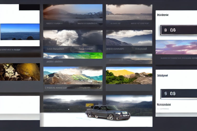
First, we will create an HTML structure for our image gallery. We shall use unordered lists to arrange the images in a flexible and responsive grid layout. Each image is wrapped within the anchor tag with its source file specified in the IMG tag.
Next, we will write the CSS to stylize the image gallery. We shall use a CSS gallery grid to layout the images and add hover effects to enhance the interactivity.
.gallery {
  display: grid;
  grid-template-columns: repeat(auto-fit, minmax(250px, 1fr));
  grid-auto-rows: 250px;
  gap: 20px;
}

.gallery li {
  position: relative;
  list-style: none;
  overflow: hidden;
}

.gallery li img {
  width: 100%;
  height: 100%;
  object-fit: cover;
}

.gallery li a:before {
  content: "";
  position: absolute;
  top: 0;
  left: 0;
  width: 100%;
  height: 100%;
  background-color: rgba(0,0,0,0.5);
  opacity: 0;
  transition: opacity 0.2s;
}

.gallery li a:hover:before {
  opacity: 1;
}
Finally, we will add the jQuery code to add even more interactivity to our image gallery. We shall use the Lightbox plugin to enable the images to expand and view in full-screen mode when clicked.
$(document).ready(function(){
    $('a').nivoLightbox();
});
There you have it, a fully functional interactive image gallery with a responsive layout created using jQuery. You can customize the gallery further by using different jQuery plugins and CSS frameworks.
Conclusion
In today's digital world, visual content is critical in engaging and capturing the attention of your audience. Creating interactive and responsive image galleries is a fantastic way to showcase your content effectively. Utilizing jQuery allows you to easily create dynamic and visually appealing image galleries without the need for extensive coding knowledge.
We hope this guide has been helpful in creating your image gallery. Get creative and explore other jQuery plugins and CSS frameworks to enhance your website's design further. Happy coding!