How to Optimize Your Website for Mobile Devices: Tips and Tricks
In this day and age, having a mobile responsive website is essential for any business or blog. With the majority of internet users accessing the web through their mobile devices, your website's mobile performance can greatly impact your online presence. If your website isn't optimized for mobile devices, you could be missing out on a large number of potential visitors and customers.
So, how can you optimize your website for mobile devices? Here are some tips and tricks:
Use a responsive design
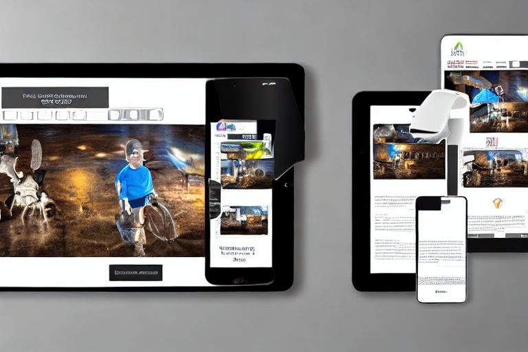
A responsive design means that your website will adjust its layout to fit the screen of any device it is being viewed on. This is essential for optimizing your website for mobile devices. With a responsive design, your website will look great on a desktop, tablet, or smartphone.
Use large and clear fonts
Mobile devices have smaller screens than desktops, so it's important to use large and clear fonts that are easy to read on smaller screens. Avoid using fancy fonts that are difficult to read or are too small. Also, be sure to use a font color that contrasts well with the background color of your website.
Simplify your menu
A menu that's designed for a desktop computer can be difficult to use on a smartphone. To optimize your website for mobile devices, simplify your menu to make it easy for your visitors to navigate your website. Use drop-down menus or a hamburger menu to make it simple and easy to use.
Minimize your website's load time
Mobile users are often on-the-go and don't have a lot of time to wait for a website to load. To optimize your website for mobile devices, ensure that your website loads quickly. This can be achieved by reducing the size of your images and optimizing your website's code.
Use high-resolution images
While it's important to reduce the size of your images, it's also important to ensure that they are high-resolution. High-resolution images will look great on any device and will enhance the overall look of your website. However, be sure to compress your images to make sure they don't slow down your website's load time.
Use clear calls-to-action
Mobile users have limited screen space, so it's important to use clear calls-to-action that are easily visible. Use contrasting colors and button styles that stand out to make it easy for your visitors to take action.
Make sure your website is easy to scroll
Mobile users often scroll through websites using their thumbs, so it's important to make sure your website is easy to scroll. Use a vertical scroll and make sure that your website's content is easy to read and navigate.
Test your website on multiple devices
To ensure that your website is optimized for mobile devices, test it on multiple devices. This will give you an idea of how your website looks and performs on different devices, and allow you to make any necessary adjustments.
In conclusion, optimizing your website for mobile devices is essential in today's mobile-first world. By using a responsive design, simplifying your menu, minimizing your website's load time, and using clear calls-to-action, you can create a mobile-friendly website that looks great and performs well.